
We turn the data your machines already produce into clear, decision-ready dashboards — collected safely, computed intelligently, delivered to any screen.
Most industrial sites already measure far more than they see. Readings sit locked inside SCADA systems, data loggers and vendor portals — each with its own login, none of them talking to the others. WaterScope connects to these sources, consolidates the data and builds the visual layer on top: one coherent, real-time picture of your entire operation.
We collect measurement data through standard APIs — REST, MQTT, LoRaWAN and NB-IoT back-ends, SCADA exports, data loggers and third-party platforms. Your instruments stay exactly where they are; we simply give their data one common home.
Raw readings rarely tell the whole story. We compute custom values on top of your data streams — combining multiple sensors into virtual instruments, calculating balances, efficiencies, specific consumption and any KPI your operation is steered by.
Live dashboards for the control room, and scheduled statements for management: daily, weekly and monthly reports delivered automatically, with exports for further analysis.
Configurable thresholds and anomaly rules watch your process around the clock. When a value drifts out of range, the right people are notified immediately — by SMS, e-mail or both, with escalation rules.
Every operation is different, so every display is built to order: gauges, trends, GIS maps, status boards and KPI tiles arranged for each role — from field technician to plant manager.
Dashboards are fully responsive and available as a mobile app, so the state of your plant is in your pocket: current values, trends and alerts wherever you are.
Our platform only listens. Data flows one way — from your process to the dashboards — with no control path back towards your equipment. Your OT network, PLCs and safety systems remain fully isolated, which makes deployment simple to approve even in critical infrastructure environments.
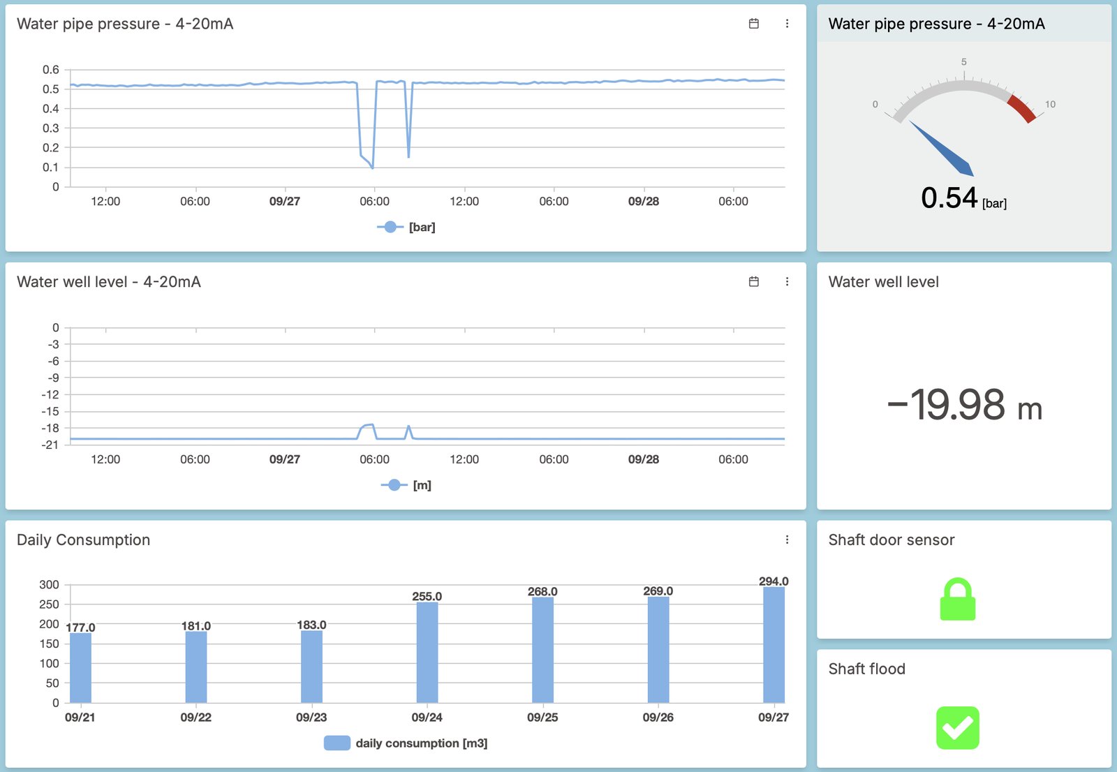
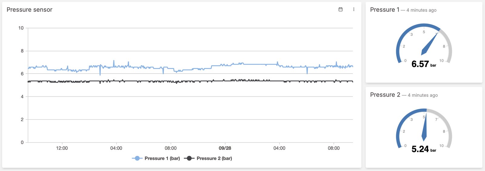
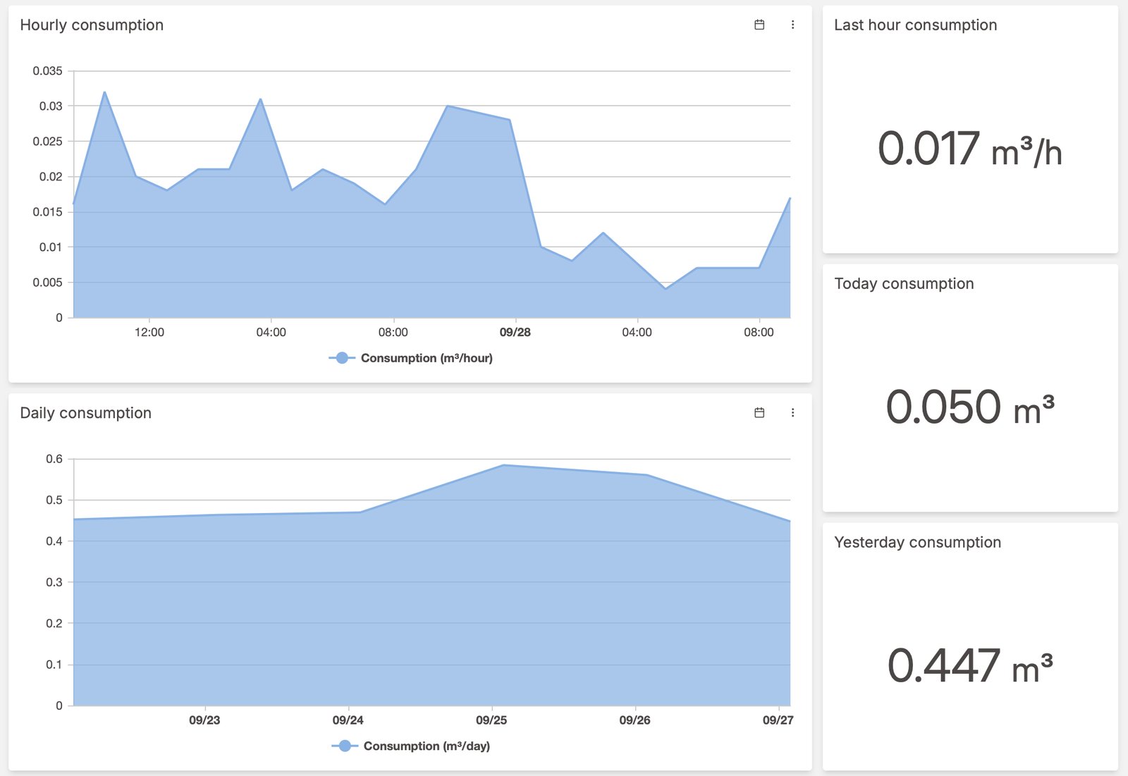
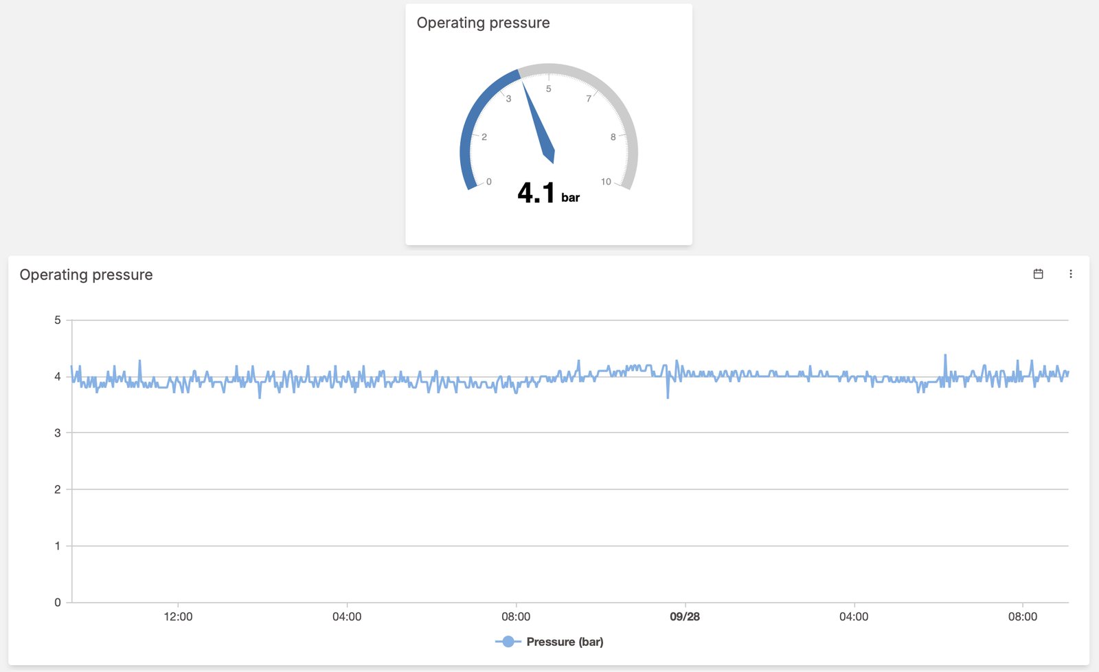
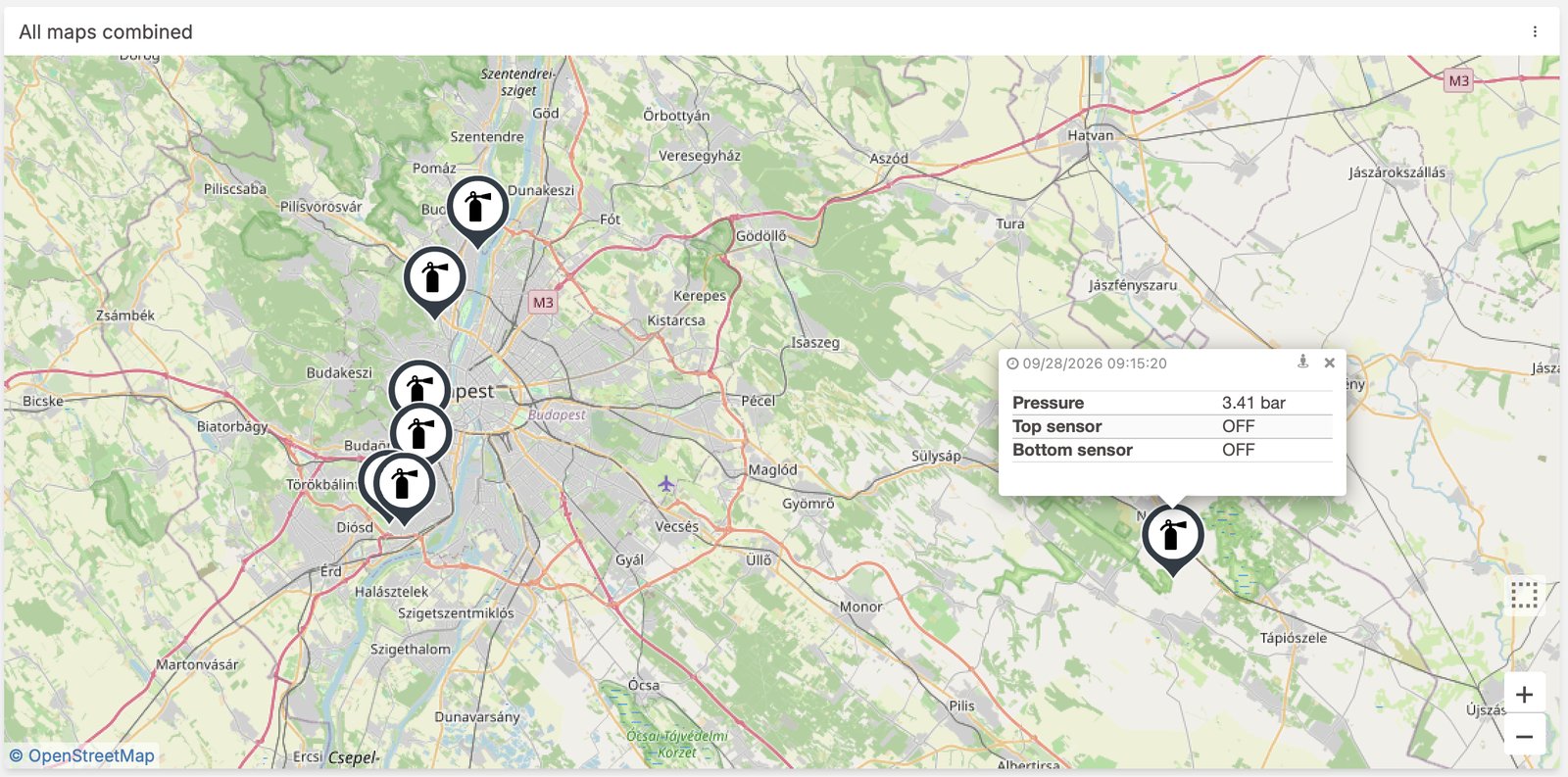
A few screens from systems we operate today — pressure and level monitoring, pump stations, consumption analytics and GIS device maps.
Tell us what you measure and what you would like to see — we typically deliver a first working dashboard from your live data within days, not months.
Request a quote